
Building a custom, accessible image lightbox in GatsbyJS
Published: October 24, 2018
In this tutorial we're going to cover the steps to creating a simple, custom, accessible image lightbox inside a GatsbyJS application. You can check out the finished example is on Github (Demo) or continue reading to dive right into the magic.
First
GatsbyJS is a blazingly fast static site generator that uses React. It has an amazing team behind it and is constantly evolving to be the go-to tool for your blog, e-commerce site, front-end of your application or anything you can think of. Not convinced? Check out their showcase to see how companies like Nike are using GatsbyJS to build awesome websites.
Getting started
If you don't have Gatsby installed, open up your terminal and type in:
$ npm install --global gatsby-cli
Then, still in your Terminal, head over to a folder you'd want to get started in and type in:
$ gatsby new GatsbyLightbox https://github.com/gatsbyjs/gatsby-starter-default
Once it's done scaffolding the starter application, type in:
$ cd GatsbyLightbox
$ yarn develop
Now open up your browser to localhost:8000 and you should see the starter application ready to go.
Open up your favourite code editor and let's start setting stuff up.
Gatsby Image
Dealing with images on the web has always been an issue. You have to have the right sizes, you have to have the right formats, if something is too big, it will load slowly, etc. Luckily, Gatsby built a plugin to handle images elegantly called gatsby-image. Using Gatsby's GraphQL queries, you can request different sizes, formats and have a few options as to how you want to handle the image load. For this tutorial we'll be using a blur up approach, similar to how Medium handles their images.
If you open up the index.js file in the pages folder, you'll see there is an <Image/> component that does exactly that.
We'll take a similar approach.
Configure gatsby-config.js
We'll put all of the images in a folder inside src/cars (You can get them from the Github repo or use your own, just make sure to follow a similar format). Then, we'll edit the gatsby-config.js file to expose that folder to a GraphQL query.
{
  resolve: `gatsby-source-filesystem`,
  options: {
    name: `cars`,
    path: `${__dirname}/src/cars`,
  },
},
Add that under the existing filesystem config and then restart your Gatsby server (I believe it's necessary for it to build the query before calling it).
Creating a Cars component
Now that we have configured the filesystem, we can go ahead and create a component that will request all the images with a GraphQL query.
Go ahead and create a new file inside src/components called cars.js.
import React from 'react';
import { StaticQuery, graphql } from 'gatsby';
import Lightbox from './lightbox';

const Cars = () => (
  <StaticQuery
    query={graphql`
      query {
        carImages: allFile(filter: {sourceInstanceName: { eq: "cars" }}) {
          edges {
            node {
              childImageSharp {
                fluid(maxWidth:2000) {
                  ...GatsbyImageSharpFluid
                }
              }
            }
          }
        }
      }
    `}
    render={data => <Lightbox carImages={data.carImages.edges} />}
  />
);
export default Cars;
Notice how the StaticQuery component is using a render prop where we're returning our Lightbox component. For now it's a simple component inside components/lightbox.js that looks like this:
import React, { Component } from 'react';
import PropTypes from 'prop-types';
import Img from 'gatsby-image';

export default class Lightbox extends Component {
  static propTypes = {
    carImages: PropTypes.array.isRequired,
  }

  render() {
    const { carImages } = this.props;
    return (
      <div>
        {carImages.map(image => (
          <Img
            key={image.node.childImageSharp.fluid.src}
            fluid={image.node.childImageSharp.fluid}
          />
        ))}
      </div>
    );
  }
}
By now, we should have all the images displaying on the home page and doing a fade-up load.
Styled Components
For styling, we're going to be using styled-components. To get it configured with Gatsby, run the following inside your terminal in our application:
$ yarn add gatsby-plugin-styled-components styled-components babel-plugin-styled-components
And add the following to gatsby-config.js:
module.exports = {
  /* existing config */
  plugins: [
    `gatsby-plugin-styled-components`,
    /* existing plugins */
  ],
};
Now, for the sake of consistency, lets restart the application. Now, we'll create a simple LightboxContainer styled component to wrap our images in. Your lightbox.js component should look like this now:
import React, { Component } from 'react';
import PropTypes from 'prop-types';
import Img from 'gatsby-image';
import styled from 'styled-components';

const LightboxContainer = styled.div`
  display: grid;
  grid-template-columns: repeat(5, 1fr);
  grid-gap: 5px;
`;

export default class Lightbox extends Component {
  static propTypes = {
    carImages: PropTypes.array.isRequired, // eslint-disable-line
  }

  static state = {
    open: false,
  }

  render() {
    const { carImages } = this.props;
    return (
      <LightboxContainer>
        {carImages.map(image => (
          <Img
            key={image.node.childImageSharp.fluid.src}
            fluid={image.node.childImageSharp.fluid}
          />
        ))}
      </LightboxContainer>
    );
  }
}
Now the page should look something like this:

Creating the Lightbox
For the sake of accessibility, we'll be using Dialog from Reach UI - shout out to Ryan Florence for making awesome, accessible tools for React. PS, Gatsby's router is using @reach/router under the hood, so we're keeping it in the family 😉
Let's go ahead and install all the dependencies:
$ yarn add @reach/dialog
And configure a basic dialog inside the Lightbox component.
import React, { Component, Fragment } from 'react';
import PropTypes from 'prop-types';
import Img from 'gatsby-image';
import styled from 'styled-components';
import { Dialog } from '@reach/dialog';
import '@reach/dialog/styles.css';

const LightboxContainer = styled.div`
  display: grid;
  grid-template-columns: repeat(5, 1fr);
  grid-gap: 5px;
`;

export default class Lightbox extends Component {
  static propTypes = {
    carImages: PropTypes.array.isRequired, // eslint-disable-line
  }

  constructor(props) {
    super(props);

    this.state = {
      showLightbox: false,
    };
  }

  render() {
    const { carImages } = this.props;
    const { showLightbox } = this.state;
    return (
      <Fragment>
        <LightboxContainer>
          {carImages.map(image => (
            <Img
              key={image.node.childImageSharp.fluid.src}
              fluid={image.node.childImageSharp.fluid}
            />
          ))}
        </LightboxContainer>
        <button type="button" onClick={() => this.setState({ showLightbox: true })}>
          Show Dialog
        </button>
        {showLightbox && (
        <Dialog>
          <p>Image will go here</p>
          <button type="button" onClick={() => this.setState({ showLightbox: false })}>
            Clos
          </button>
        </Dialog>
        )}
      </Fragment>
    );
  }
}
Now, when you click the Show Dialog button, you should see something like this:

Connecting the image click to the Lightbox
Now, we're going to convert each Img component into a button that you can click that will trigger the lightbox to open up and the right image will be selected. Here's how we do that:
import React, { Component, Fragment } from 'react';
import PropTypes from 'prop-types';
import Img from 'gatsby-image';
import styled from 'styled-components';
import { Dialog } from '@reach/dialog';
import '@reach/dialog/styles.css';

const LightboxContainer = styled.div`
  display: grid;
  grid-template-columns: repeat(5, 1fr);
  grid-gap: 5px;
`;

const PreviewButton = styled.button`
  background: transparent;
  border: none;
  padding: 0;
  margin: 0;
`;

export default class Lightbox extends Component {
  static propTypes = {
    carImages: PropTypes.array.isRequired, // eslint-disable-line
  }

  constructor(props) {
    super(props);

    this.state = {
      showLightbox: false,
      selectedImage: null,
    };
  }

  render() {
    const { carImages } = this.props;
    const { selectedImage, showLightbox } = this.state;
    return (
      <Fragment>
        <LightboxContainer>
          {carImages.map(image => (
            <PreviewButton
              key={image.node.childImageSharp.fluid.src}
              type="button"
              onClick={() => this.setState({ showLightbox: true, selectedImage: image })}
            >
              <Img fluid={image.node.childImageSharp.fluid} />
            </PreviewButton>
          ))}
        </LightboxContainer>
        {showLightbox && (
        <Dialog>
          <Img fluid={selectedImage.node.childImageSharp.fluid} />
          <button type="button" onClick={() => this.setState({ showLightbox: false })}>
            Close
          </button>
        </Dialog>
        )}
      </Fragment>
    );
  }
}
Now, if you click on one of the images, it should look something like this:
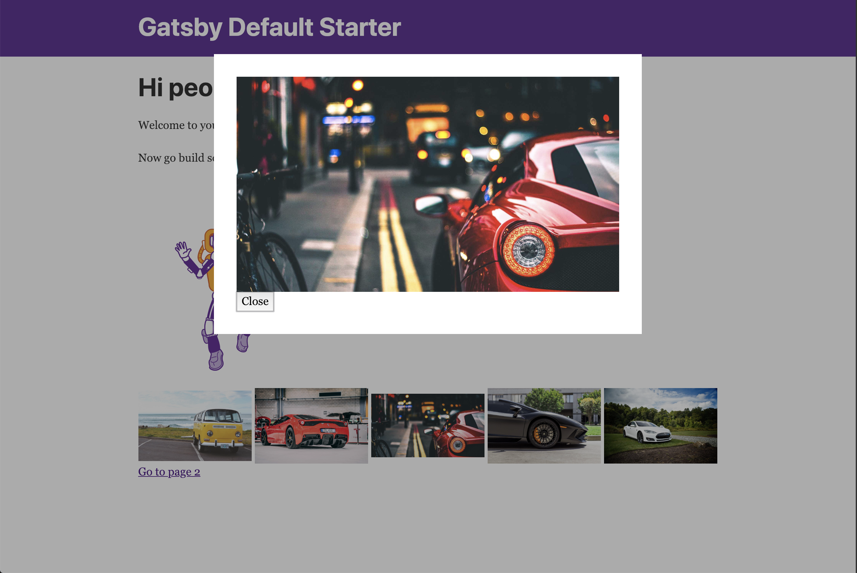
Now you can go ahead and implement this in your e-commerce store, picture gallery, or anywhere else you might see fit 😃
Thank you for your time, Serg
Feel free to tweet me if you have any questions, comments, requests or just want to show some ❤️.